
Why Does Microsoft Keep Changing Its Logos?
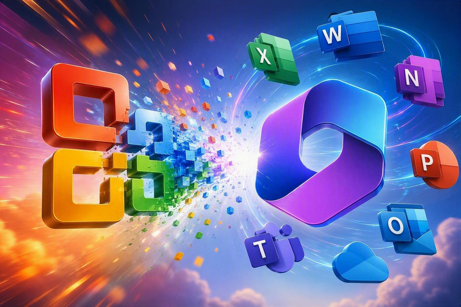
I have been watching a few videos lately from Allan Peters, a logo designer and author who shares fantastic breakdowns of famous logos (U-Haul, Amazon). He dives into how they evolve and why seemingly tiny design choices make a massive difference.
 Naturally, that sent me down a rabbit hole.
Because I spend most of my working life somewhere inside the Microsoft ecosystem, I started thinking about Microsoft logos. More specifically, I found myself asking a question that most of us have grumbled at our screens at one point or another:
Why does Microsoft keep changing them?
I do not mean this as a complaint. I actually like many of the recent designs. But I am old enough to remember when a logo redesign made immediate business sense.
You had Office 2003. Then Office 2007. Then Office 2010, followed by Office 2013.
Those were major product milestones. New software shipped every few years with new features, glossy retail packaging, massive marketing campaigns, and a fresh visual identity that clearly announced, “Hey, this is the new one.”
That is simply not how software works anymore.
Microsoft 365 is evergreen. Word does not get a brand-new boxed release every three years. Neither does Excel, PowerPoint, Outlook, Teams, SharePoint, or any of the cloud services we rely on daily. Features and interface tweaks roll out continuously in the background.
So why do the icons keep evolving?
Digging into Microsoft’s own design rationales reveals that the answer goes far deeper than simply keeping things looking modern.
Logos Aren’t Version Markers Anymore
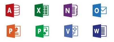 Microsoft’s explanation for its 2018 redesign of the Office icons captured this transition perfectly.
At the time, the design team noted that the refreshed icons reflected how Office itself had changed. It had evolved from isolated desktop software into a collaborative, cloud-connected suite used across multiple devices. Microsoft explicitly described the new icons as a “signal to customers” of those product shifts.
That phrase stuck with me.
A signal to customers.
In a SaaS world, that may be the primary role a logo plays. Twenty years ago, the retail release itself was the signal. Office 2007 arrived, and everyone knew where things stood.
 Today, Microsoft rolls out hundreds of changes across Microsoft 365 every year. Some are minor bug fixes; others fundamentally transform how we collaborate. But there is no longer a single day when you walk into a CompUSA to see a towering pyramid of retail software boxes. (Yes, I just dated myself with that reference.)
Without those massive launch events, Microsoft needs another way to communicate that the platform has entered a new chapter. A visual refresh provides that milestone.
And Then Came AI
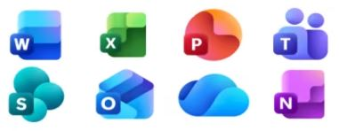
The latest Microsoft 365 icon refresh makes this intention obvious. Microsoft openly calls them “icons for the AI era.”
According to Microsoft, the updated look reflects a unified ecosystem where Copilot weaves directly across tools, rather than treating each program as an isolated silo. Microsoft Design described this update as a subtle visual change signaling a deeper transformation beneath the hood.
There is that concept again: a signal.
Word did not stop being Word when its icon updated, and Excel remains a spreadsheet. But the underlying strategy shifted. Microsoft wants us to perceive the platform through a different lens.
Moving Past Individual Applications
For decades, we compartmentalized these tools:
- Write a document in Word
- Crunch numbers in Excel
- Build a deck in PowerPoint
- Manage messages in Outlook
That brand identity is etched into muscle memory. The colors alone do the heavy lifting: blue for Word, green for Excel, orange for PowerPoint, and purple for Teams.
Today, Microsoft’s business model relies on viewing these apps as interconnected spokes of a single wheel: Microsoft 365, Microsoft Graph, Copilot, autonomous agents, and fluid data exchange.
The tighter that integration becomes, the more vital it is to share a unified visual language. It explains why modern Microsoft icons share consistent depth, geometry, gradients, and lighting. They are designed to preserve individual app recognition while reinforcing a quiet truth: these tools belong to the same engine.
The Multi-Screen Reality
There is also a purely functional driver behind these changes: where the icons actually live.
An Office 2003 icon had an easy job. It sat on a Windows desktop, a Start menu, a taskbar, and a cardboard box on a shelf.
Today’s Microsoft 365 icons must render cleanly across Windows, macOS, iOS, Android, web browsers, Teams workspaces, high-density monitors, smart watches, and dark mode interfaces. Microsoft’s Fluent Design system exists precisely to keep those elements readable across every conceivable screen size and lighting condition. Sometimes an icon redesign is simply practical maintenance for a multi-device world.
The Real Cost of Disruption
Brand equity is expensive to build, and Microsoft has accumulated decades of it.
Nobody needs a caption to identify the green “X” as Excel. When Microsoft alters that visual shorthand, even slightly, it spends a fraction of that hard-earned familiarity.
There are tangible ripple effects:
- Documentation and user manuals become outdated overnight.
- Training videos and slide decks instantly look stale.
- Admin guides, intranet hubs, and help-desk materials require new screenshots.
- End users spend a few disorienting seconds wondering why their favorite taskbar button looks unfamiliar.
None of these hurdles are deal-breakers on their own, but they carry a real administrative cost. The strategic value of signaling a new era must consistently outweigh the friction of confusing the user base.
The Modern Software Launch
In the packaged software era, logos helped us identify versions. In the SaaS era, they help us recognize strategic shifts:
- Desktop utility
- Cloud collaboration
- Modern workplace
- AI and autonomous agents
The code may update continuously, but strategic corporate visions move in chapters. Without a shrink-wrapped box to mark the start of a new phase, visual identity does the heavy lifting.
The next time an icon updates on your taskbar and prompts the usual internet debates about whether the previous version looked better, look past the aesthetic polish.
The interesting part is rarely the icon itself. It is what Microsoft wants you to believe about where the platform is heading next.