Leveraging the New Office App
As you’ve probably seen in the MASSIVE media push, the new Office app for iOS and Android is now available! Leveraging the new Fluent Design System, Microsoft describes this app as “(combining) the Word, Excel, and PowerPoint apps you know and rely on, with new capabilities that harness the unique strengths of a phone to create a simpler, yet more powerful Office experience on the go.”
I shared this tip in the February 2020 Productivity Tips webinar, which you can find on the blog, watch the entire webinar on the CollabTalk YouTube channel, or jump to the specific tip in the video by clicking here.
There is a great article by Jon Friedman, head of Microsoft Office design, on the reimagining of the app – and how Microsoft has more to come. In Jon’s words, here is why Microsoft redesigned the user experience, and how they approached the task of essentially merging the capabilities of five separate and distinct apps into one streamlined solution:
Our designers and researchers from around the world convened in a metaphorical global huddle to learn how our customers use these micro-moments and to develop a mobile-focused design strategy for the new Office app on iOS and Android. We studied customers in mobile-first and mobile-only markets to understand how people organically use their phones to create content and complete tasks. We observed people who were inherently on the go, like students, and looked at how they used their phones to efficiently complete tasks. We also studied people who were never at a desk, like shop floor workers, and noted how they got work done without a computer.
Here’s the promo video:
You can also download the app from the store at https://apps.apple.com/app/microsoft-office/id541164041
 What is Under the Hood?
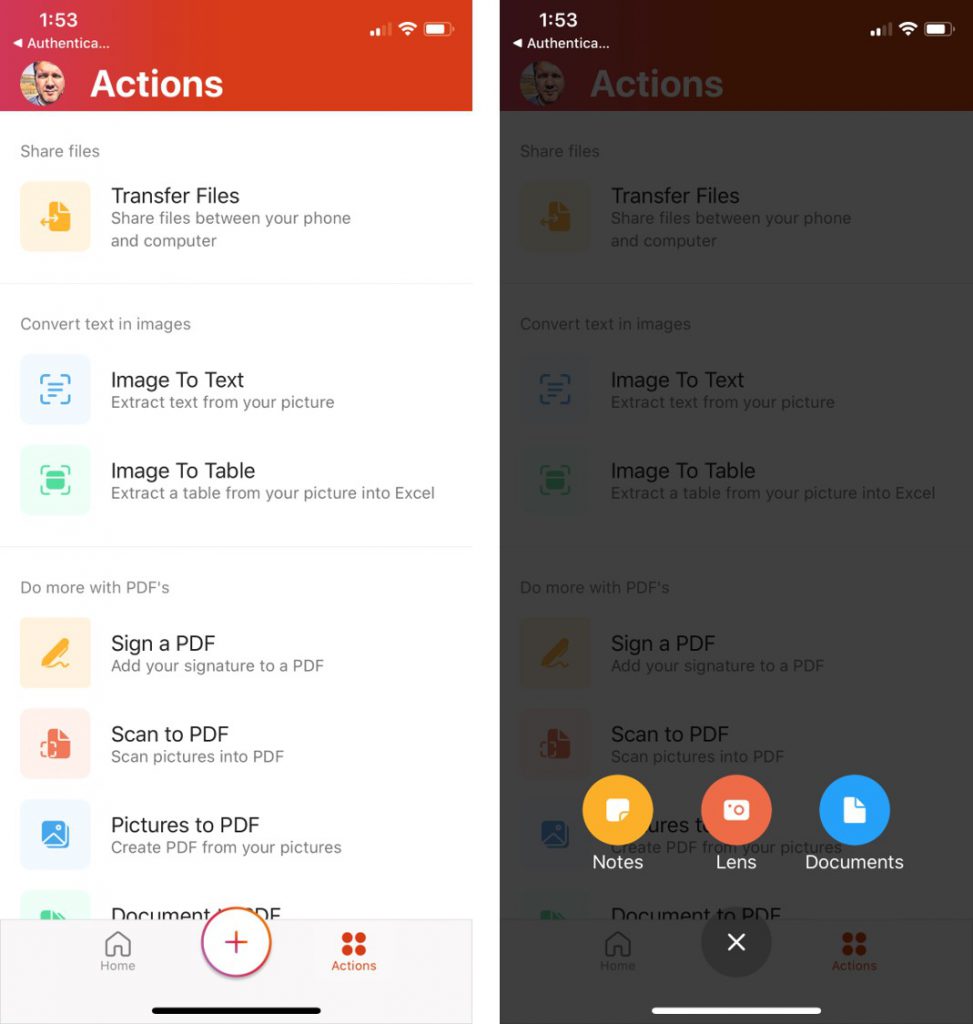
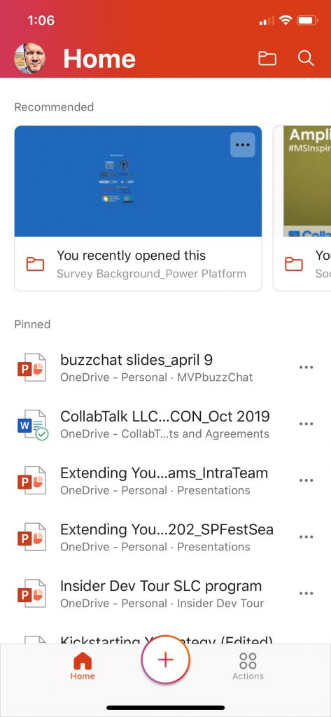
Opening the app, your default view is your Home screen, which looks like the OneDrive app, with recommended content based on user activity, your pinned content, and then a listing of content based on your history (opened yesterday, this week, last week, older). At the bottom of the screen you will see three primary buttons: Home, the center + symbol, and Actions. Clicking the + symbol brings up the primary features of the app:
- Adding notes, which are like sticky notes that you can save on your phone, or send/share in a number of formats.
- Snapping photos and videos with Lens, which is essentially the Office Lens app that accesses your camera.
- Reviewing and editing documents and slides, which is the entry point for the Word, Excel, and PowerPoint capabilities of the app.
The Actions button provides some of the long-awaited productivity features we’ve been hearing about for months:
- Easily transfer images and files between your PC and phone
- Convert image to text and table in Excel
- Convert text within images to usable text
- Create and manipulate PDFs, including signature capability (which is awesome!)
In addition, the app allows you to:
- Find content, review visual cards
- Pin important documents
- Search for content across connected libraries
- Review and edit content in mobile format
- …and preview in print view
- View and edit metadata
- Share files from your mobile device
One caveat mentioned by fellow MVP Hal Hostetler (@TVWizard): Office mobile has an issue that Word, PowerPoint, and Excel mobile DO NOT have. It insists that all data and its cache must be in Internal memory. The three stand-alone apps allow data and cache to be placed in External memory (your MicroSD card). If you have an older phone or a newer one with limited memory, Hal points out that it is easy to run out of memory. Outlook mobile has the same issue PLUS it has no “sync slider” like the desktop app to limit memory load.
Office App vs. Standalone Apps
The big question on everyone’s mind is whether the new Office app replaces the standalone mobile apps for Word, Excel, and PowerPoint — and possibly even OneDrive and Office Lens. The short answer is: If you like your apps, keep your apps. I will not outline each and every feature of each app, but provide you with a general comparison of each with enough detail to hopefully help you figure out if your “legacy” apps are worth keeping. Here’s what I think:
Word App Comparison
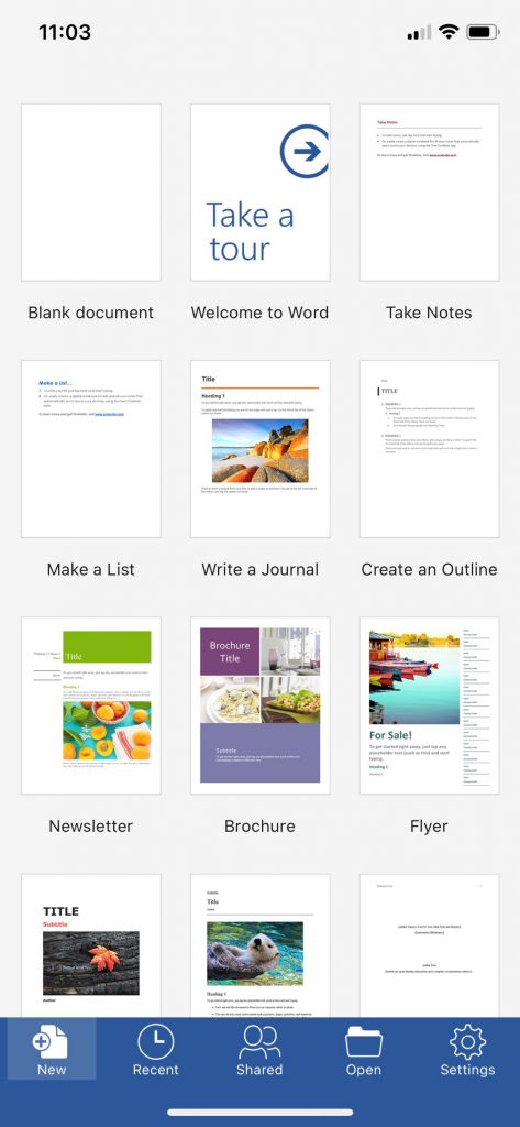
If you’re unfamiliar with the Word, Excel, or PowerPoint mobile apps, each of them provides a consistent experience. Microsoft has done a great job over the past few years unifying certain UX components such as when you share content, or when you search. No matter which app you use, when you click Share, you’ll see a common set of options and a similar look and feel. The home page for each app follows this same pattern. Here you can see the home page for the Word app, providing a quick way to create a new document utilizing one of the many standard templates. From the nav bar at the bottom, you can quickly find recently viewed documents, see what content has been shared with you, search for and open files, or manage your settings.
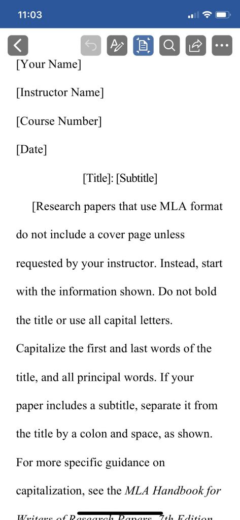
The default reader view makes it easy to see and edit your content, with large mobile icons for the primary controls.
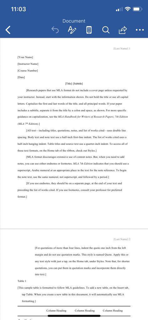
As with the desktop version of Word, you can also view your documents in print view before sending the file, printing, or continuing your work.
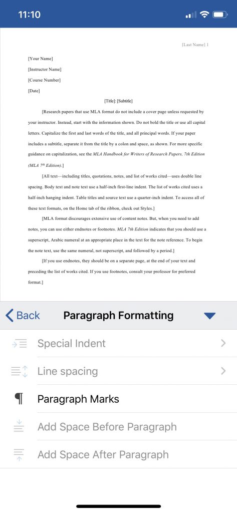
The ellipses opens the bottom menu, giving you more formatting options — with some options grayed out and unavailable depending on the view. In this example, the options are limited while in Print view.
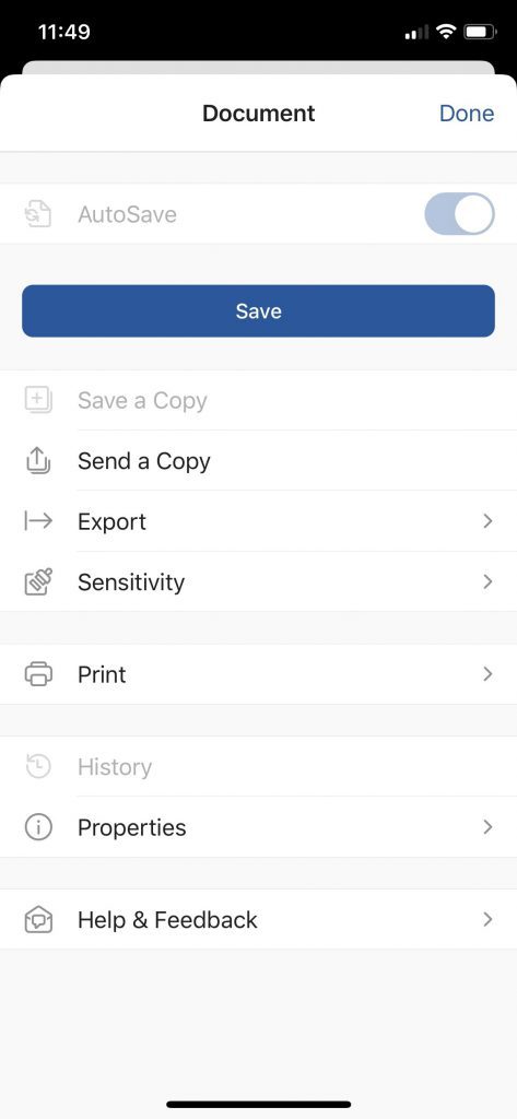
The Word mobile app also gives you multiple options to send, export, and view and modify properties, including sensitivity labels.
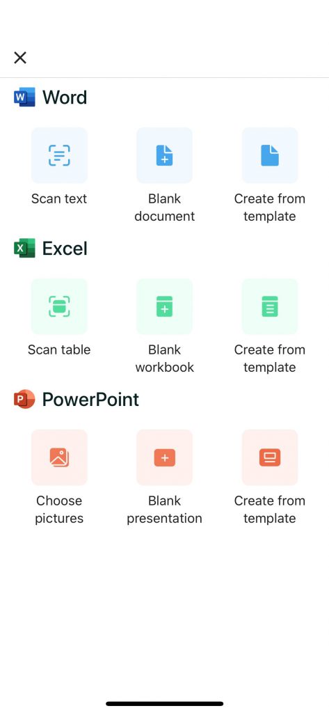
Within the new Office app from the Home screen, click on the + icon and select Documents to reach the following screen, from which you can create new documents, spreadsheets, or presentations. The Scan Text and Scan Table options shown here are features also accessible through the Actions button on the Home page.
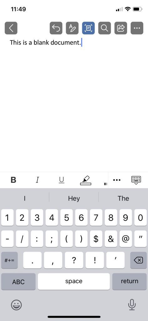
As you can see, creating and editing a Word document created within the new Office app is basically an identical experience from the standalone Word mobile app.
Excel App Comparison
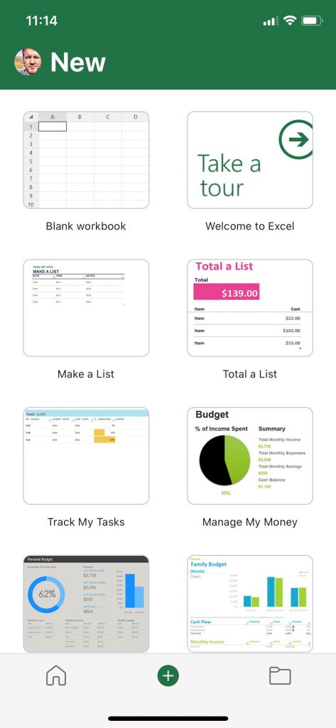
While I don’t typically create new spreadsheets from my mobile device, I’m sure there are some of you out there who do this regularly. Similar to the Word app, the initial screen within the Excel mobile app allows you to create a new blank workbook or select from a number of common templates.
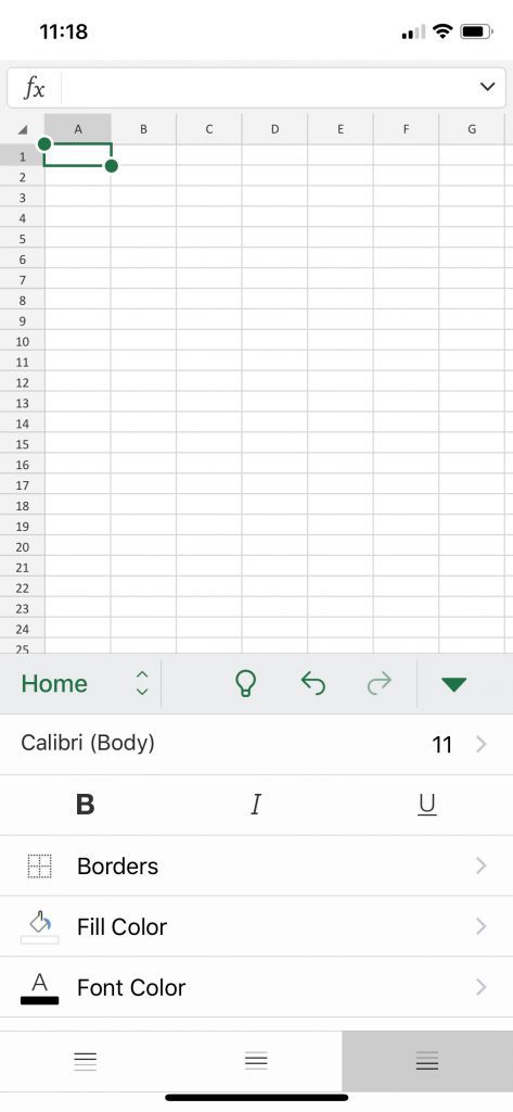
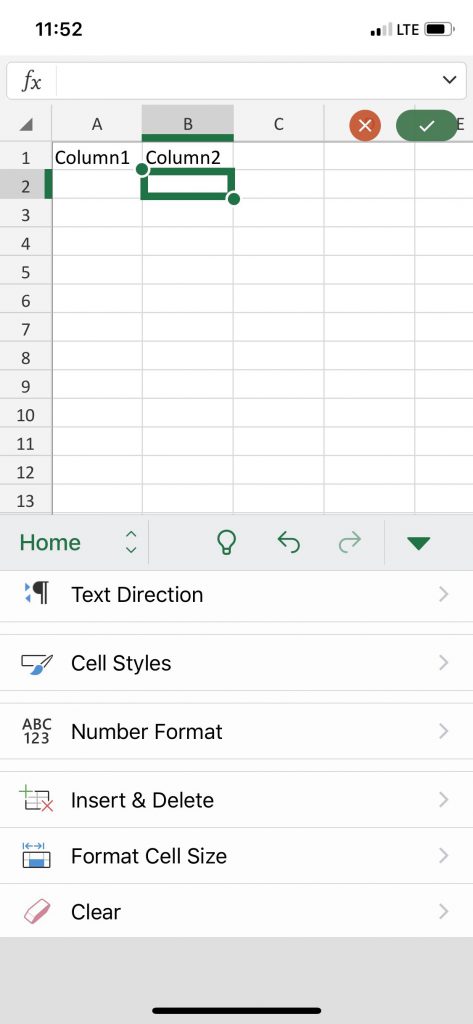
While the mobile app is missing quite a few features from the desktop version, it does provide quite a few powerful features, allowing you to create, format, and add functions to your spreadsheet from the comfort of your mobile device. I suppose that if you’re sitting in your car at the mall, and your friends have been inside for hours, creating a spreadsheet on your phone might pass the time more quickly…
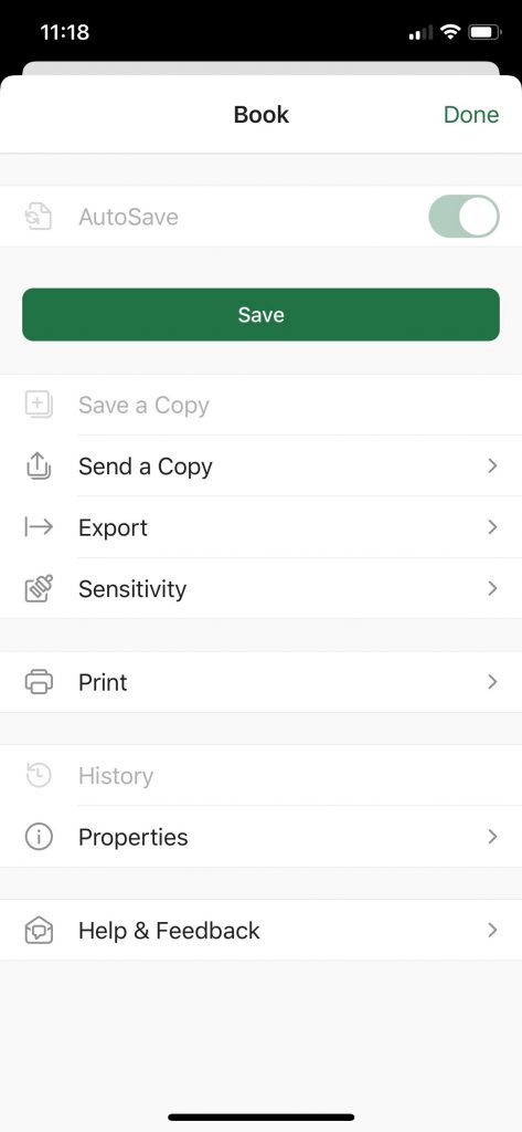
And like the Word app, you can see the same common UX for sharing, exporting, printing, and managing the properties of your spreadsheets.
Within the new Office app, it’s pretty much the exact same experience.
PowerPoint App Comparison
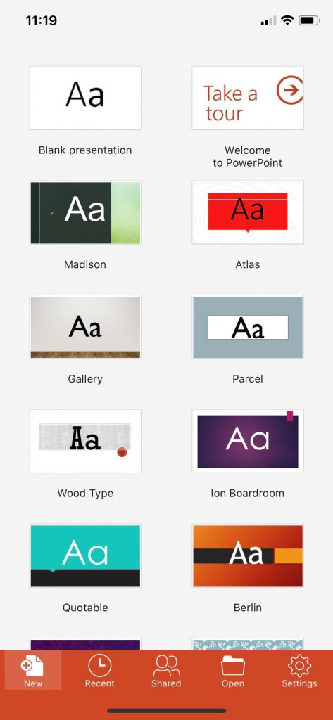
If you’re done building your spreadsheets and your friends have still not exited the mall, why not create a PowerPoint presentation on your phone? Same initial experience, allowing you to create a slide deck from scratch or select from a number of common templates.
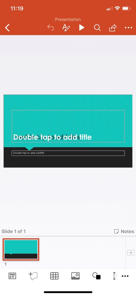
You have all of the formatting options, as well as the social features — allowing you to view, edit, and comment on slides that have been shared.
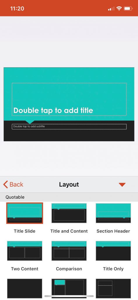
You have the ability to quickly reformat slides, add images, and most of the other core features of the desktop version — all while you sit and wait for your friends at the mall. I suppose you could get out and go look for them, but why leave the security of your car when you could create PowerPoints?
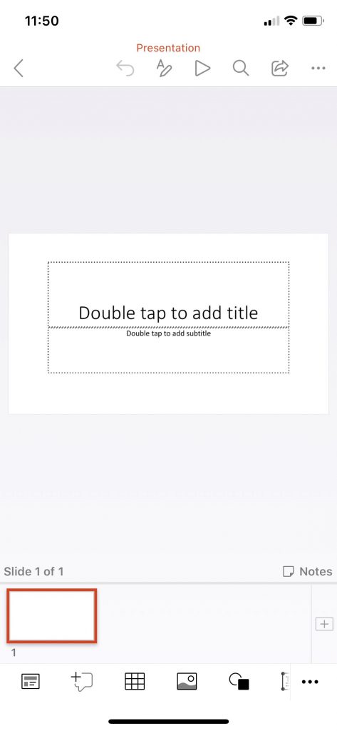
Once again, within the new Office app, the available features are at parity with the standalone PowerPoint mobile app….even if my screen shot is less colorful than the previous images.
OneDrive App Comparison
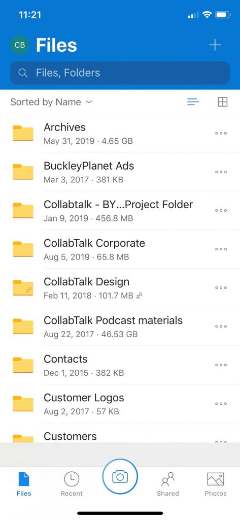
While I may not be a major user of the standalone Word, Excel, and PowerPoint apps, I am more familiar with the OneDrive mobile app. I love how Microsoft has created a consistent UX for file management across applications, and it is readily apparent from this app.
As an example, compare the above image with this snapshot of the Excel mobile app file management experience.
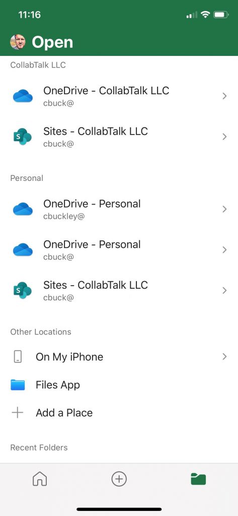
Within the new Office app, the UX is aligned with each of the standalone apps — as well as the desktop app experience.
You can search within existing cloud locations, including your SharePoint and OneDrive locations, which means also accessing O365 Groups-enabled Teams and Yammer. Additionally, you can quickly and easily add new cloud locations, including a long list of 3rd party tools.
Office Lens App Comparison
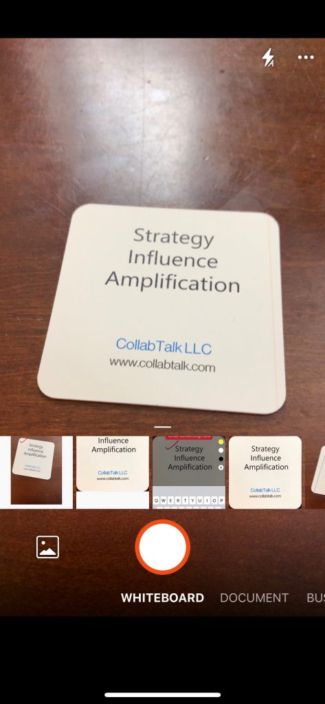
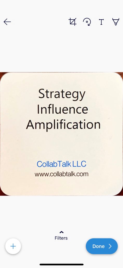
Finally, a quick comparison to one of my favorite apps — Office Lens. I am a regular user of Office Lens, even though this capability has been added into the OneDrive app….and is now in the new Office app. When snapping a photo, it gives you the ability to identify the image source, whether you’re taking a picture, capturing your work on a whiteboard, taking a photo of a document (instead of using a scanner), or snapping a picture of a business card.
In this example, I have selected the option for Business Card. As you can see, the Office Lens app (or OneDrive app, or Office app) “right-sizes” or justifies the image, and gives me the option to apply a filter to make the content more readable/sharable.
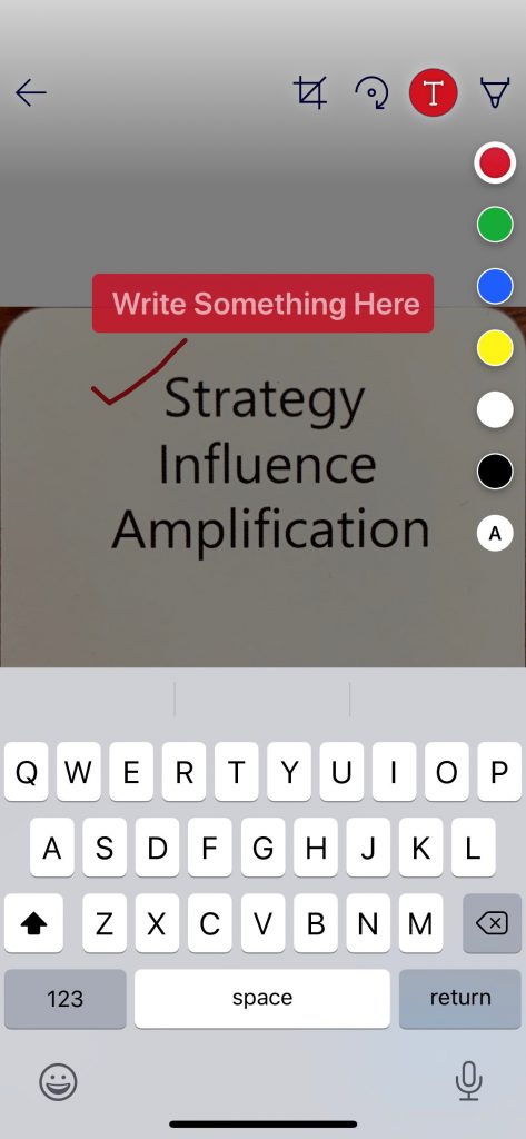
Additionally, I can mark up the image, highlight certain information, or add text. What’s great about this capability is that you can meet someone at an event, snap a photo of their business card and hand it back to them, add notes to remind you when, where, and who the person was, and then share the card with your sales or marketing team back at the home office.
I am a huge advocate for this functionality, and have used Office Lens for as long as the app has been available — and I’m thrilled to see this functionality as part of the new Office app.
Conclusion
For me personally, the new Office app completely replaces the need for standalone Word, Excel, and PowerPoint applications. If there are some features missing from these apps in the new Office app, please let me know and I’ll update this text, but from my review, there appeared to be good parity between them. I’m not yet sure that the Office app will displace my usage of Office Lens, but that is more out of habit. But I don’t think the app will replace my use of the OneDrive app, as it provides a streamlined experience for file searches and sharing on my mobile device.
Overall, I am excited to see Microsoft re-thinking some of their core app user experiences. I’m a big fan of the Outlook, Teams, SharePoint and Yammer apps, and look forward to any further streamlining and innovation that may come from that field. I’m not privy to anything on this front — just a fanboy interested in seeing what will come next.
Hope you have found this review useful!

