Visualize your Data with Ideas in Excel
I’ve said it many times: the *coolest* innovations coming out of Microsoft these days are based on artificial intelligence (AI) features. If you are a fan of the Ideas option in PowerPoint that auto-magically improves the design and layout of your slides, and were wondering when this fantastic, AI-driven feature would be included within Excel, it’s here!
Excel Ideas helps users create high-quality documents, presentations, and spreadsheets in less time. Put simply, it uses AI to transform your data into simple visualizations to help you easily identify summaries, trends, and patterns. In addition to getting recommendations from Ideas, you can also directly ask questions about your data and narrow down the Ideas by selecting only the fields you want to see, which I’ll illustrate in the simple example below.
This is another great tip from the most recent (March 2020) Office 365 Productivity Tips webinar, which you can find on the blog, on the CollabTalk YouTube channel, or jump to this specific tip in the video by clicking here.
See your data options
Most people have no idea where to begin with building data visualizations inside of Excel. We all have spreadsheets, and often need to share that data with colleagues…and so we copy-and-paste a table into our slides and call it good. We now have help! When you select fields to be represented, Ideas analyzes that data—speeding up the process and presenting fewer, more targeted suggestions.
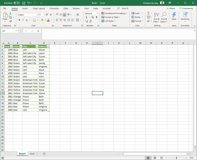
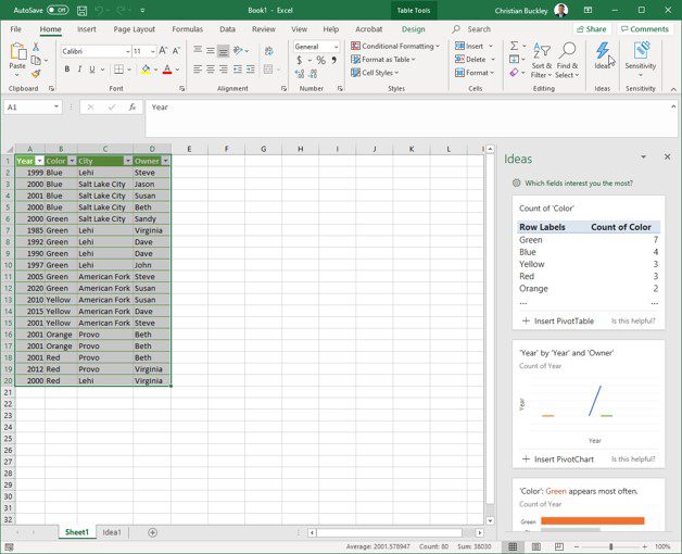
To start using Ideas in Excel, select your data set, and then click on Ideas on the top right ribbon.
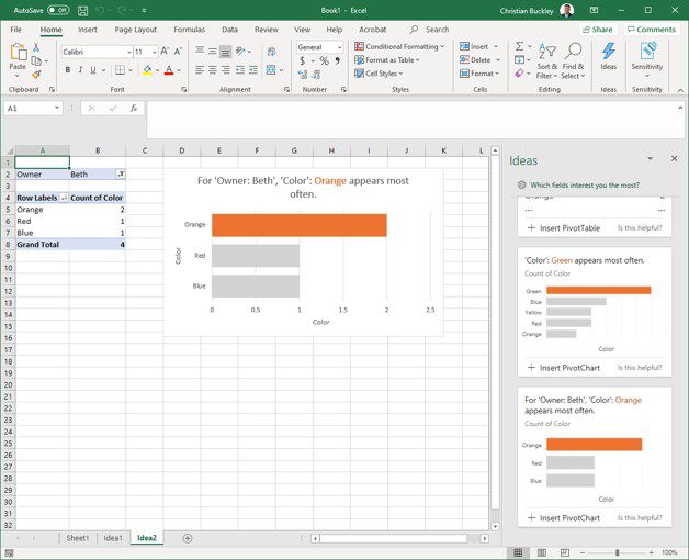
A panel opens on the far right with different visualizations of your data, which you can select and insert into your spreadsheet, or tweak a little until you create the right visualization.
Refining your options
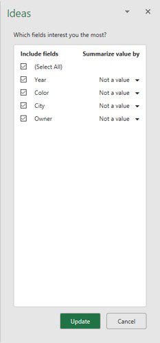
You can refine the options you see by selecting specific fields on which to focus. These options change the visualizations available to you on the right. The intent of the Ideas feature is to provide a jumpstart into these visualizations – which you can tweak and adjust to create the right view of your data and convey the right messaging.
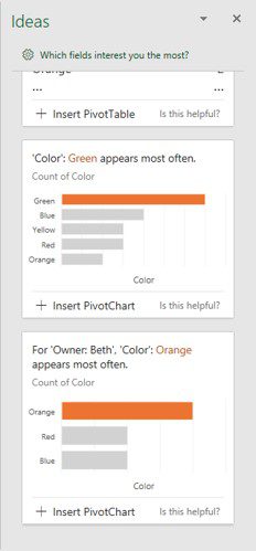
Once you’ve identified the visualization that works best for your data, select +Insert PivotChart
Once your PivotChart has been selected, a new tab is opened within your spreadsheet, with an abbreviated set of data based on your selection and the related PivotChart. From here you can cut and paste into a presentation, or further manipulate the look and feel or the data.
Ideas for Excel just might make you look half-way competent in Excel 😉
To learn more about Ideas in Excel, you can watch this video or read this article. Hopefully you find this productivity tip helpful!



1 Response
[…] Visualize your Data with Ideas in Excel [buckleyPLANET] […]