
5 Unrealized Quality-of-Life Demands from Microsoft Users
We live in an era of tech development where it feels like every single software update is chasing the next shiny object. Companies throw massive budgets at flashy AI integrations, predictive algorithms, and sweeping design overhauls that look fantastic in a keynote presentation. But if you talk to the people who actually live, work, and build inside these operating systems every day, you quickly realize something: it is not always about inventing new features. More often than not, it is about refining what we already have.
 I love digging through the various forums looking for unanswered (or poorly answered) questions from business users that might be a fit for a future episode of the #M365AMA series (yes, it’s coming back!). One thing I’ve noticed is that people do not just want more stuff; they want the tools they use every single hour to work elegantly, logically, and reliably (i.e. fix the stuff that we’re already using!). There is a deep, burning desire for baseline quality-of-life improvements, the kind of refinement that users want. Really, really want. Yet, year after year, some of the most basic, heavily upvoted community requests go unanswered.
I thought it would be fun to quickly walk through the top five items on the ultimate Microsoft user wish list that, until very recently for one of them, have felt entirely ignored:
1. The Taskbar Customization Renaissance
For power users who live or die by their multi-tasking efficiency, the launch of Windows 11 felt like an odd step backward for desktop ergonomics. Microsoft stripped away decades of taskbar flexibility, forcing icons to aggregate and stack. While they eventually brought back a basic “Never Combine” toggle after widespread pushback, they left desktop purists stranded without a way to natively shrink the taskbar height or use small icons without risky registry hacks.
As it turns out, persistence occasionally pays off. In a massive “we hear you” moment, Microsoft recently dropped a major announcement for Windows Insiders. They are officially testing a native “Small Taskbar” toggle that cuts down the bar’s height and shrinks icons to reclaim vertical real estate. Even better, they are finally letting users move the taskbar to the top or sides of the screen again. When you pair a side-mounted taskbar with the “Never Combine” and “Show Labels” settings, you get a clean, vertical list of every open window. It only took a few years, but desktop flexibility is finally crawling its way back, as detailed in the latest feature rollout announcement on the Windows Insider Blog.
2. Death to the “Recommended” Ghost Town
The “Recommended” section at the bottom of the Windows 11 Start Menu is widely considered prime digital real estate that went horribly wrong. Microsoft designed it to surface recent files and newly installed apps. The problem is that millions of users do not want it there. Currently, if you go into Settings and turn off the toggles to hide recent files and recommendations, Windows does not actually remove the section. Instead, it just leaves a massive, unyielding chunk of blank, wasted vertical space at the bottom of your Start Menu. The community has been begging for a simple checkbox that deletes the divider entirely, allowing the pinned apps grid to expand downward and utilize 100 percent of the space. While recent build rumors suggest Microsoft is trying to rebrand the layout, frustrated users are still swapping workarounds and voicing their collective annoyance over the wasted UI real estate in threads like this one inside Reddit’s Windows 11 Community.
3. Native Light/Dark Mode Scheduling
We live in a world where your smartphone, your tablet, and even rival desktop operating systems seamlessly transition from crisp light themes during the day to eye-strain-reducing dark themes the moment the sun sets. It is an automated, set-it-and-forget-it feature. Yet, on a flagship Windows PC, if you want your system-wide theme to shift based on the time of day, you have to open Settings and click it manually. The only workarounds involve downloading third-party utility apps or writing custom scripts inside the archaic Windows Task Scheduler tool. A native, simple “Schedule based on sunset/sunrise” toggle within Personalization remains a baffling omission on the default feature list, forcing users to repeatedly bump upvoted requests on the Microsoft Feedback Hub just to save their eyesight at night.
4. Moving Out of the Control Panel “Halfway House”
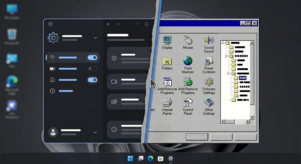
Windows 10 launched over a decade ago with the promise of a modernized, unified Settings app. Here we are, deep into the lifecycle of Windows 11, and the operating system is still stuck in a bizarre state of architectural cleavage. If you want to adjust basic display settings, you use the slick, modern UI. But the moment you need to configure advanced audio routing, tweak a legacy network adapter, or manage deep user profile permissions, the OS shunts you backward in time to the classic, gray Control Panel interface that looks virtually unchanged from the Windows 7 era. IT admins and everyday users alike are tired of hunting through two entirely different design generations to change a single advanced setting. We just want a single, consolidated pane of glass, an ongoing friction point that continues to spark fierce debate as outlined in the deprecation analysis on TechPowerUp.
5. A One-Click “Local Search Only” Emergency Brake
Remember when the Windows Search bar was a lightning-fast utility designed to help you find a local document, a folder, or a desktop app? Somewhere along the line, it mutated into a portal for the broader internet. Today, typing the name of a local executable frequently causes the search menu to pause, query the cloud, and push Bing web results, trending celebrity news, or predictive AI suggestions right to the top of your list, often burying the actual file you were looking for. While you can technically disable web search injection, doing so requires digging through complex Group Policy Objects or hacking the Registry. Users want a straightforward, prominent toggle in the main Settings app that severs the search bar from the web entirely. Local means local.
At the end of the day, software development is a balancing act. We understand that tech giants have to keep pushing boundaries to stay competitive in an AI-driven market. Even the massive Microsoft only has so many engineers and product managers who try to balance new features with necessary fixes within each build. But, in case anyone from those Microsoft teams are listening — taking care of the fundamentals is what builds true user loyalty.
We should all keep upvoting these quality-of-life requests in the feedback loops, holding out hope that more of them get the “Small Taskbar” treatment soon. In the meantime, we should probably keep our expectations grounded. While we might eventually get a fully consolidated Settings menu or an off-switch for web searches, certain other community requests, like a built-in psychic interface that opens your files before you think of them, or a “Teleport to Meeting” button in Microsoft Teams, are probably never going to happen. Until then, we will settle for fewer web results and a Start Menu that does not waste space.